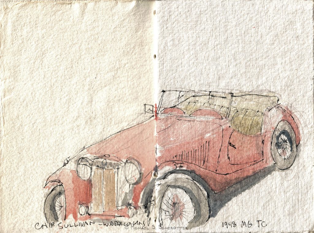
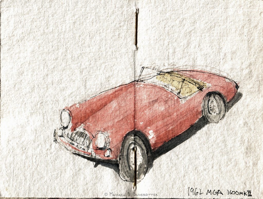
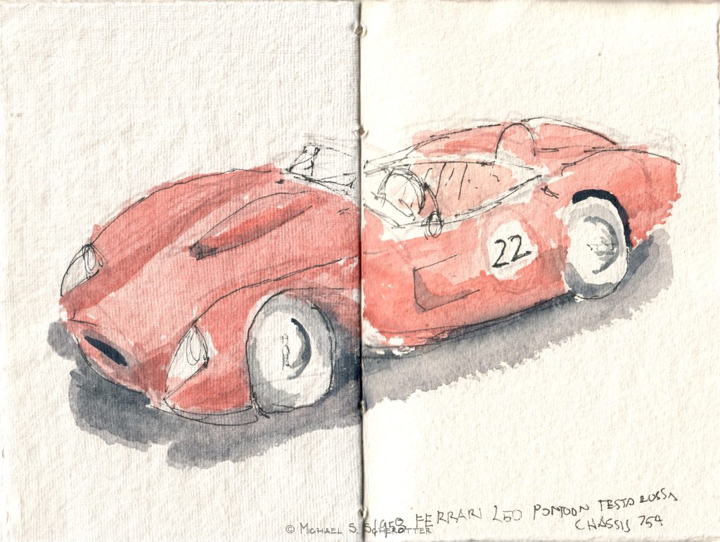
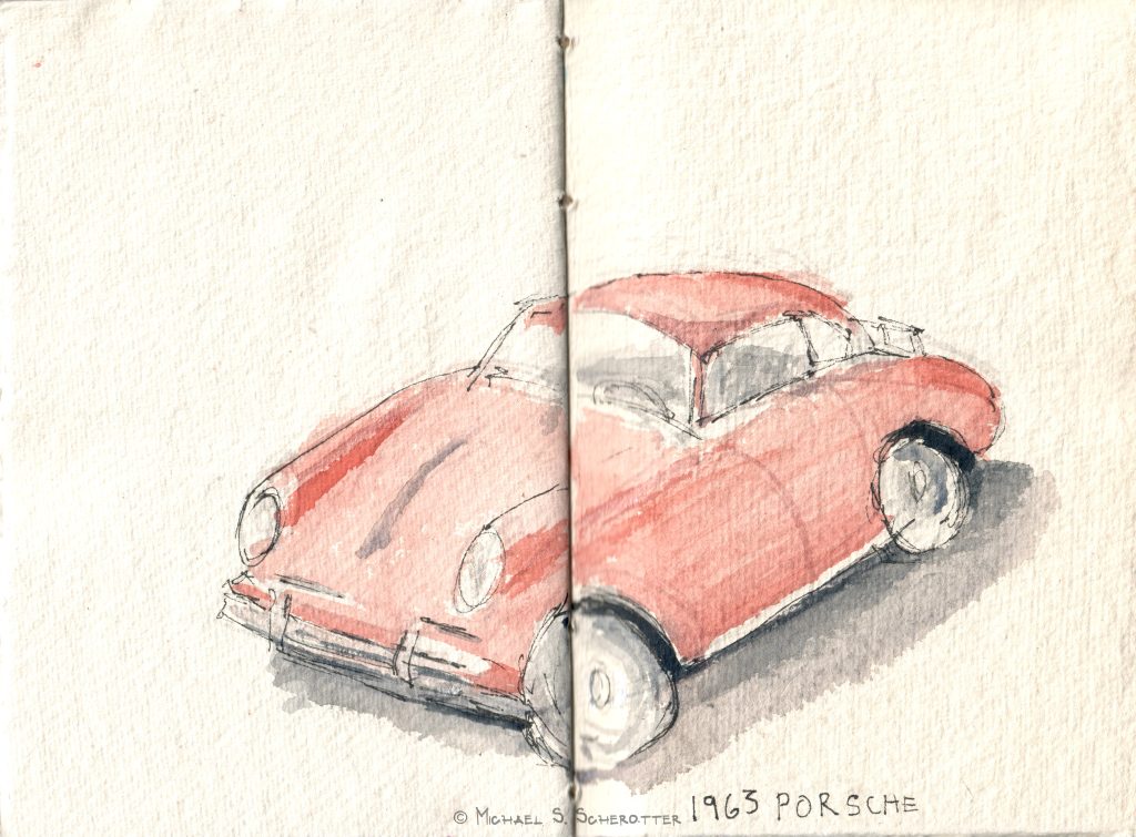
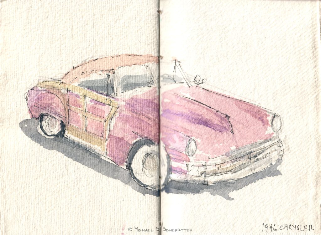
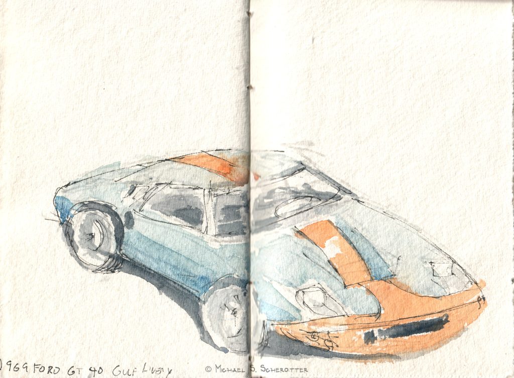
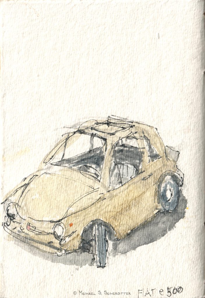
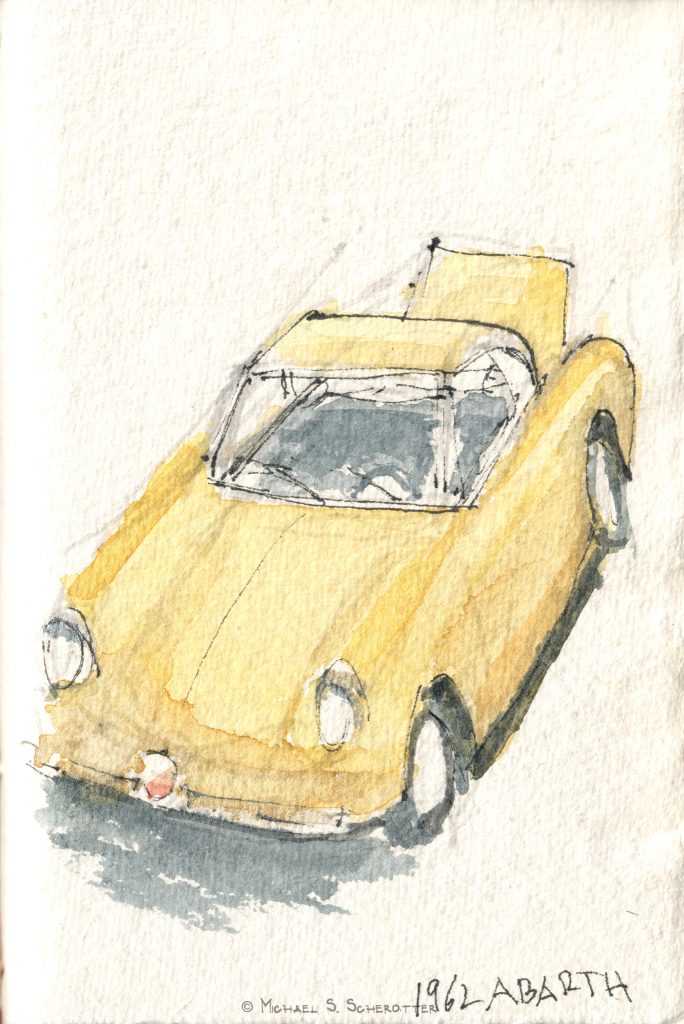
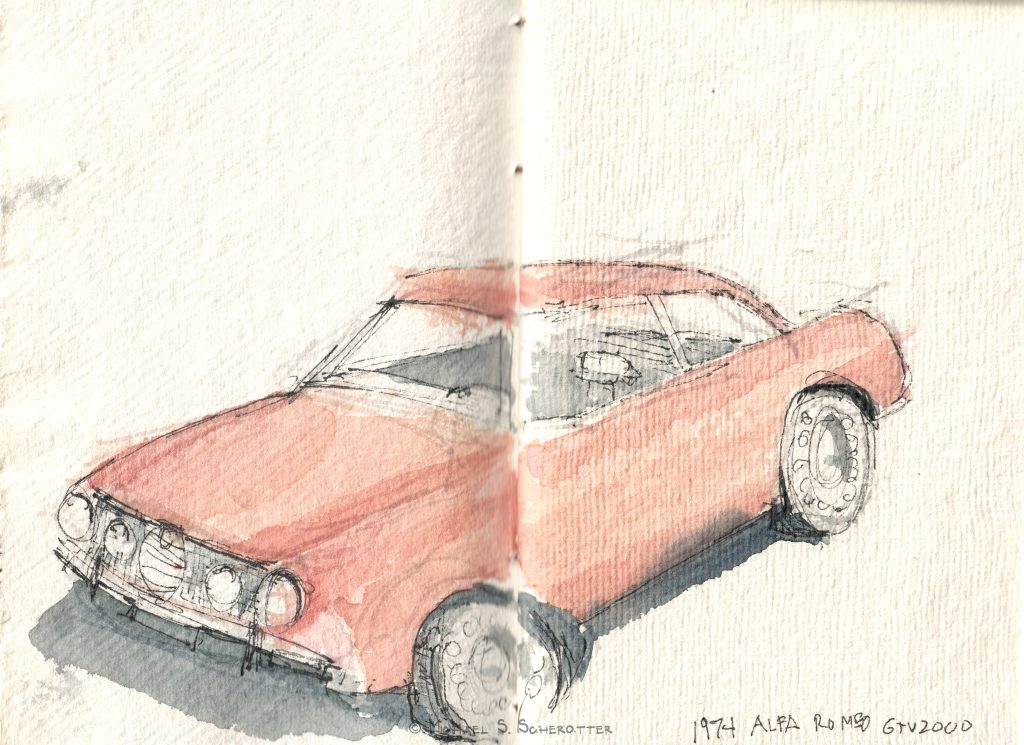
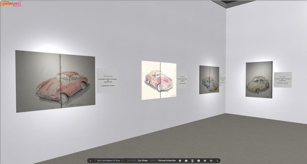
1948 MG TC1962 MGA 1600 MKII1958 Ferrari 250 Pontoon Testa Rossa Chassis 7541963 Porsche1948 Chrysler1969 Ford GT 40 Gulf LiveryFiat e5001962 Abarth1974 Alfa Romeo GTV2000
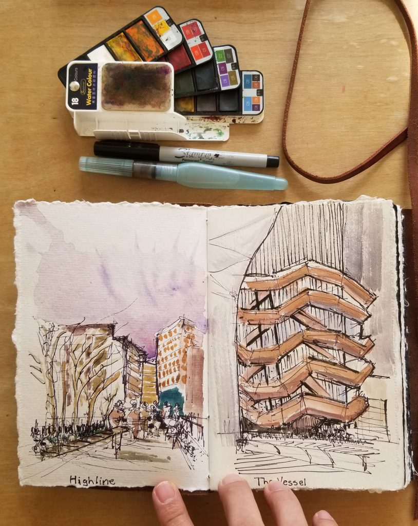
Each watercolor took me between 20-25 minutes in my journal. I start out with a rough sketch using a light gray Tombow dual brush pen, then add color with my watercolors, and then add some linework using a waterproof Pentel Finito pen.
If you have a car and would like a custom watercolor painting of it, please reach out to me – as I do commissions. See details here.
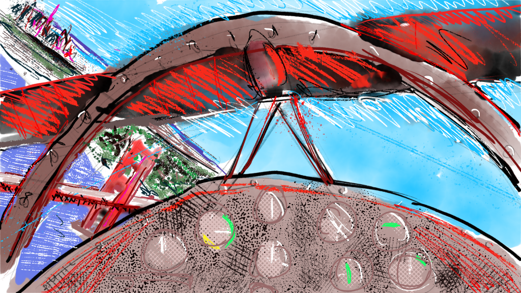
The New Microsoft Flight Simulator has opened a new location for me to take my sketching: anywhere in the world. One of the first games that I played on my first computer, an IBM PCjr was Microsoft Flight Simulator in the 1980s and that started my journey into computation with a fascination of a three-dimensional environment represented on a flat screen. The technology has advanced amazingly since then and so have my drawing skills.
San Francisco Bay from my Aviat Pitts Special S2S drawn with Adobe Fresco
The imagery and geometry that is now in Microsoft Flight Simulator is very accurate, lifelike, and for me, an urban sketcher, good enough to sketch. The application give me the foreground, an airplane cockpit, the midground, buildings and geology, and the background of scenic vistas with accurate weather rendering.
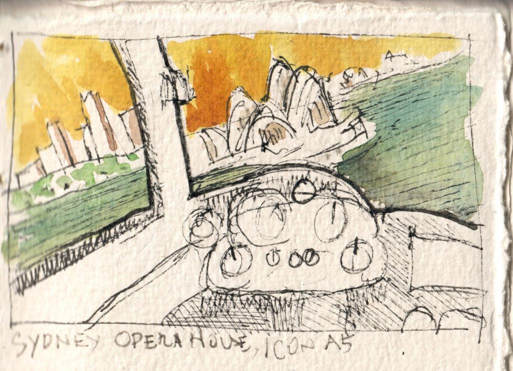
Sydney Opera House from my Icon A5 drawn in my journal
I pick a location, an airplane, and fly to get just the right point of view, then I press [Pause]. I then start sketching in my journal from Iona Handcrafted Books, Adobe Fresco, or even my Sketch 360 app. Since these sketches aren’t from real life, I shouldn’t call them Urban Sketches, so I’ve decided to call the Virtual Flight Sketches with the hashtag #VirtualFlightSketch.
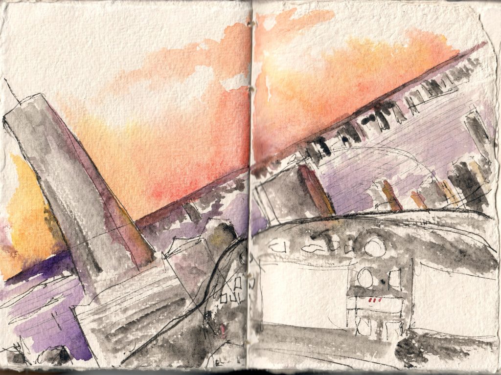
Manhattan at Sunset from my JMP VL-3
I’ve always wanted to see the pyramids of Egypt.
Giza Pyramids an Sphinx from my JMP VL-3
I created my latest Virtual Flight Sketch with my Sketch 360 app and exporting as an animation video that you can interact with.
San Francisco from EX ZLin Savage Cub
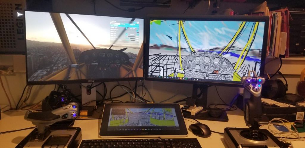
For this sketch, I had the Flight Simulator in the left screen and Sketch 360 running on the Wacom One display tablet for the drawing canvas and on the right display where it showed the 360 view.
360 Sketching studio setup.
The funny thing about pausing in Flight Simulator is that the plane stops in mid-flight but the clock does not stop. This means that if I’m doing a sketch at sunset, the lighting is going to change during the time of my sketch. It adds a realistic aspect to the experience. I know that I could easily take a screenshot and work from that, but I choose not not.
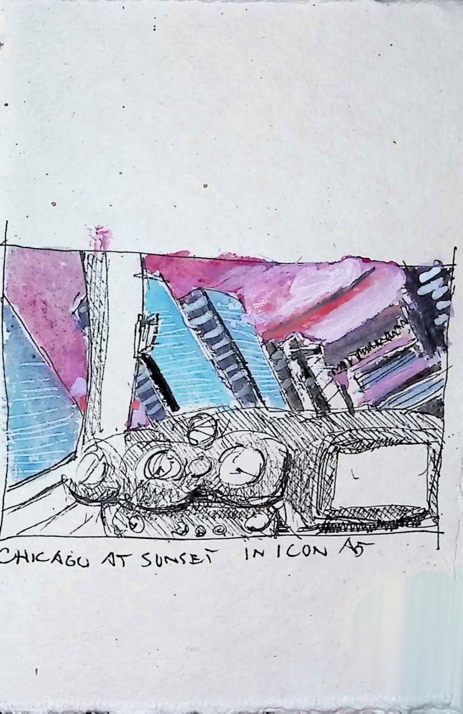
Chicago at Sunset in Icon A5 Virtual Flight Sketch
Where should I fly for my next #VirtualFlightSketch ?
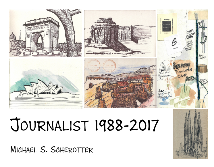
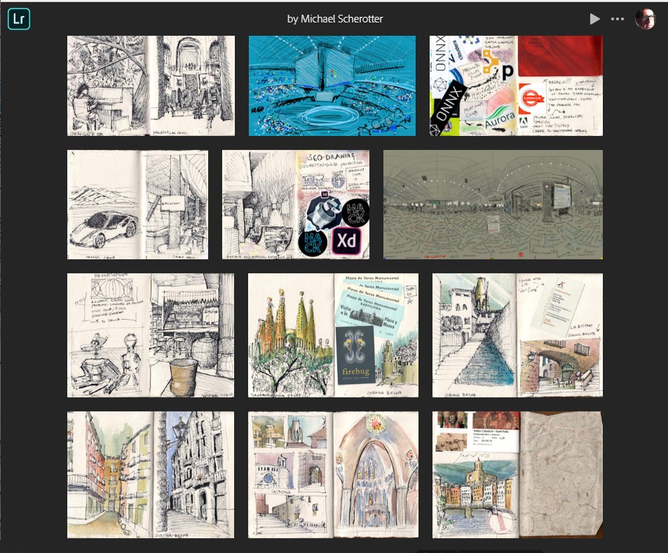
During the shelter-in-place I have been compiling pages from my journals into a first book and wanted to share that with my community to solicit some feedback.
The pages are in chronological order spanning 10 journals over 29 years.
On October 26 2019, I will be leading a workshop on analog+digital 360 sketching at the CODAME Art+Tech Festival in San Francisco, CA. The festival is 3-day conference about the intersection of art and technology with many mind-expanding workshops and exhibitions helping people see how artists, musicians, technologists, and researchers are fusing technology to artistry and creativity.
Ever since studying architecture in college, I’ve thrust myself into this intersection focusing my passion on creative tools both analog (journals) and digital (computer tablets) and using the digital to make the analog (3D printing). People have often asked me on how I draw the line: will I ever give up my journaling? Which do you like better analog, the fountain pen, or the digital pen? It’s not simple but recently, I’ve clarified it by asserting that for the digital mediums, I focus on things I can’t do easily with my analog tools of pens, pencils, watercolors, knifes and glue sticks.
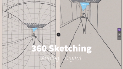
Recently I’ve been focusing on a specific type of medium that I’ve created the app Sketch 360 for, and that’s the domain of the workshop on Saturday at the CODAME festival. I’m going to start the workshop with pens and paper, helping the participants understand the equirectangular projection that 360 sketching is based on and then move to digital tools.
Sketch 360
Creative Tool Chains
The aspect of creativity that has always interested me is the process that people take in their creative endeavors and the tools that people use in this process. After my architecture degree (BArch), I got master’s degree (MArch) in design tool development and have been passionate since then in crafting tools to help people be more creative. I have done experimenting recently in creating chains of creative tools like this:
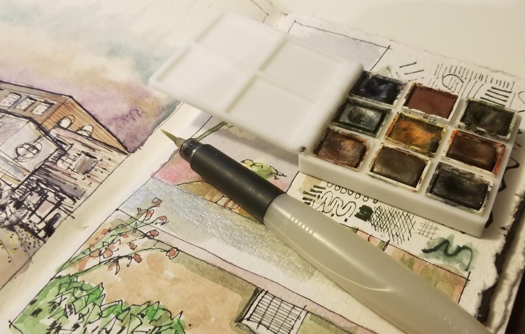
Using OpenSCAD (a creative tool that lets you write code to make 3D models that can be printed on a 3D printer) to design a parametric watercolor kit.
Hosting that model on Thingiverse where people can customize (a creative tool) it and output a model to their exact specs that they can print
Using the watercolor kit that I printed (a creative tool), to paint a watercolor
Watercolor kit
In this way, I look at a watercolor brush and code both as creative tools. Sometimes the chain has parallel links:
I’m looking forward to going to the CODAME Art-Tech festival because I want to meet others who look at creativity and technology like I do: people who want to mix it up, bounce ideas, experiment, try new things. DM me at @Synergist if you want a discount code for the festival.
I’ve been creating artwork, primarily in journals and sketchbooks for over thirty years and have recently started cataloging it in Adobe Lightroom CC to share. Starting with a simple pencil drawing of American Airlines food dish in 1987 to a pen and watercolor sketch of Central Park last week, I’ve scanned, tagged, and uploaded much of the work. Please browse it, add your comments and give me your feedback. Create. Every. Day.
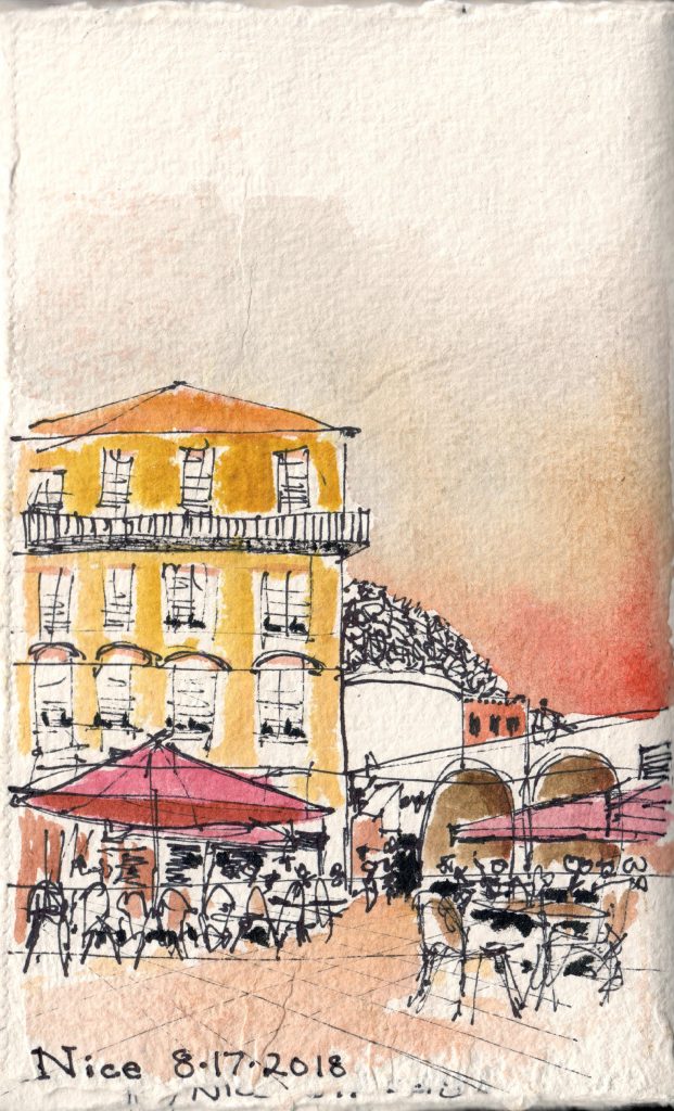
With the warm Cote d’Azur late afternoon sun on my neck, I looked out on the deep blue cloudless sky of Nice and I knew right there that when I painted the blue sky it must be a bright crimson melting to yellow. Capturing the past two weeks in watercolors and sketches was my way of chronicling my family vacation from Spain to France. I have been doing a type of art/travel of journaling for thirty years now, punctuating my travels into individual pages in a leather-bound journal filled with watercolor paper. Now I was taking the scene in front of me and reconstructing it on one of those pages. To explain how I constructed this specific painting I’d like to give you a bit of the story on how my style developed. Since I started watercoloring 30 years ago, I had learned and perfected a conservative wet-on-dry watercoloring technique perfect for portable watercolors and journals but now I was experimenting with a much more random whatever-may-come wet-on-wet vibrant-color method. I was trying something new and it was exhilarating.
To give a bit of a background, I learned watercoloring when studying architecture and always strived for accurately representing the colors that I saw. I used a travel watercolor set with nine mixing pans which allowed me to mix and develop a color off the page, and when it was just right, I filled my brush with it, and stroked on the page of the journal composing a colorful painting. The synthesis of color adjacent to the white of the paper gave the watercolor it’s unique feel. It’s a very safe method and the interplay of chroma was found in the intersection of opposites, mixing the red with the green, the blue with the orange.
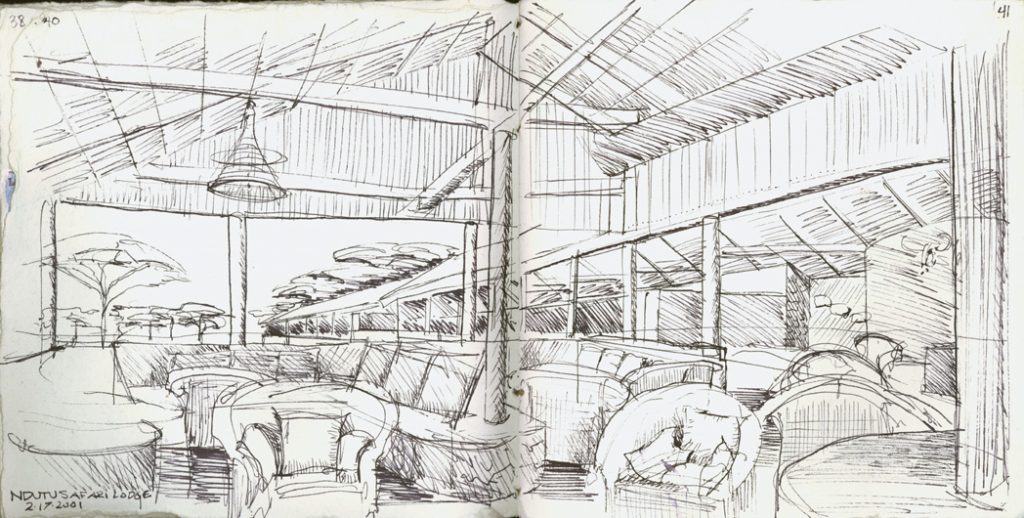
Tarangire Safari Lodge, Tanzania, 2001
The funny thing is that my drawing technique is the opposite of safe. My preferred drawing tool is an ultra-fine-point Sharpie pen with a deep black waterproof ink whose marks are indelible, definite, undoable. I always liked deep, dark, marks, never erasable graphite. My affinity towards pens over pencils started also in architecture school when I tried publishing my work with the common tool of the time, a Xerox photocopier. Back then, the photocopier reproduced the subtle shading of pencil drawings horribly so I gravitated towards the crisp, dark, blackness of fountain pens which flowed an opaque contrast onto the white paper. My favorite was the Lamy Safari, which unlike many I’ve used was extremely reliable. The black music of ink flowed from the nib with ease and fluidity keeping up with my ambition to chronicle places.
With that fountain pen, I honed my forgiving
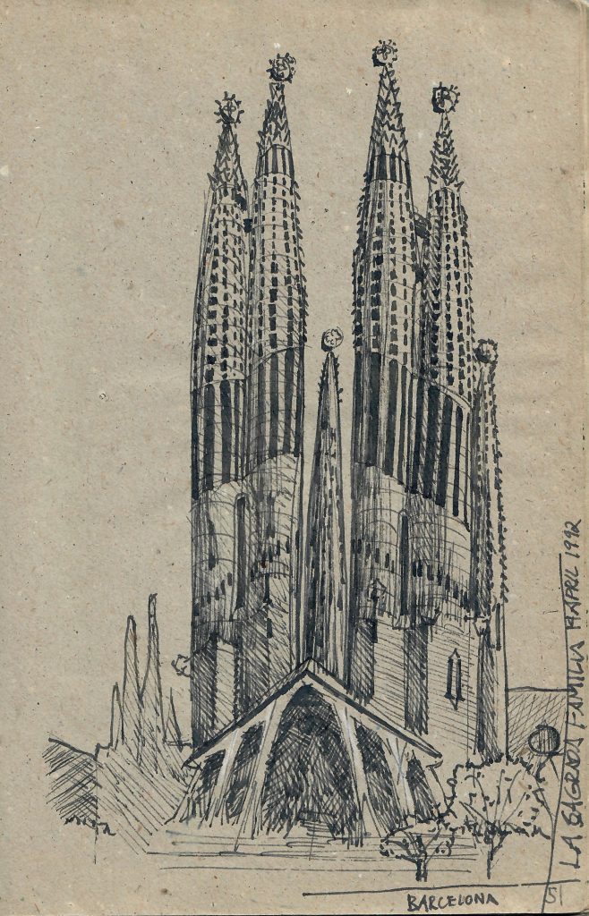
Sagrada Familia, Barcelona, 1992
sketching style living up to Mike Lin‘s mantra “be loose.” I developed my
poché styles of stippling, crosshatching, and controlled scribbling, understanding that the texture and tone mattered more than the color. Put together with a mastery of freehand perspective taught by the late Kirby Lockard at the University of Arizona, my style started to develop. I combined accurate perspective with a loose sketch style to quickly capture places, moods, ideas, notions, and the shapes that inhabited my vision. Nothing was out of bounds, musicians, animals, street scenes, doodles, all inhabiting the page along with the ephemera of my travels documenting my journey.
Always wanting to try new tools, I purchased a new travel watercolor kit online with an interesting array of 18 vibrant colors but with only two mixing pans. This forced me to try developing my colors on the page. I used a wet-on-wet on wet technique where I first wet the are that I wanted to color with clean water and then added dabs of color to parts of the water puddle on the page. The pigment particles suspended in the water spidered out across the puddle blending with other colors dispersing with their entropy. The flexibility of my journal meant more difficulty controlling the water as it inched towards the edges of the page aided by gravity and limited by the evaporating water. This was the challenge that I jumped at. A few months earlier, I had met up with some Urban Sketchers in London to spend the afternoon sketching and saw firsthand in Homephoenix Wong a watercolorist who purposefully painted in the wrong colors. It was marvelous seeing yellows, vermillion, and purples in a London overwhelmed by grays and browns. I had to try this.
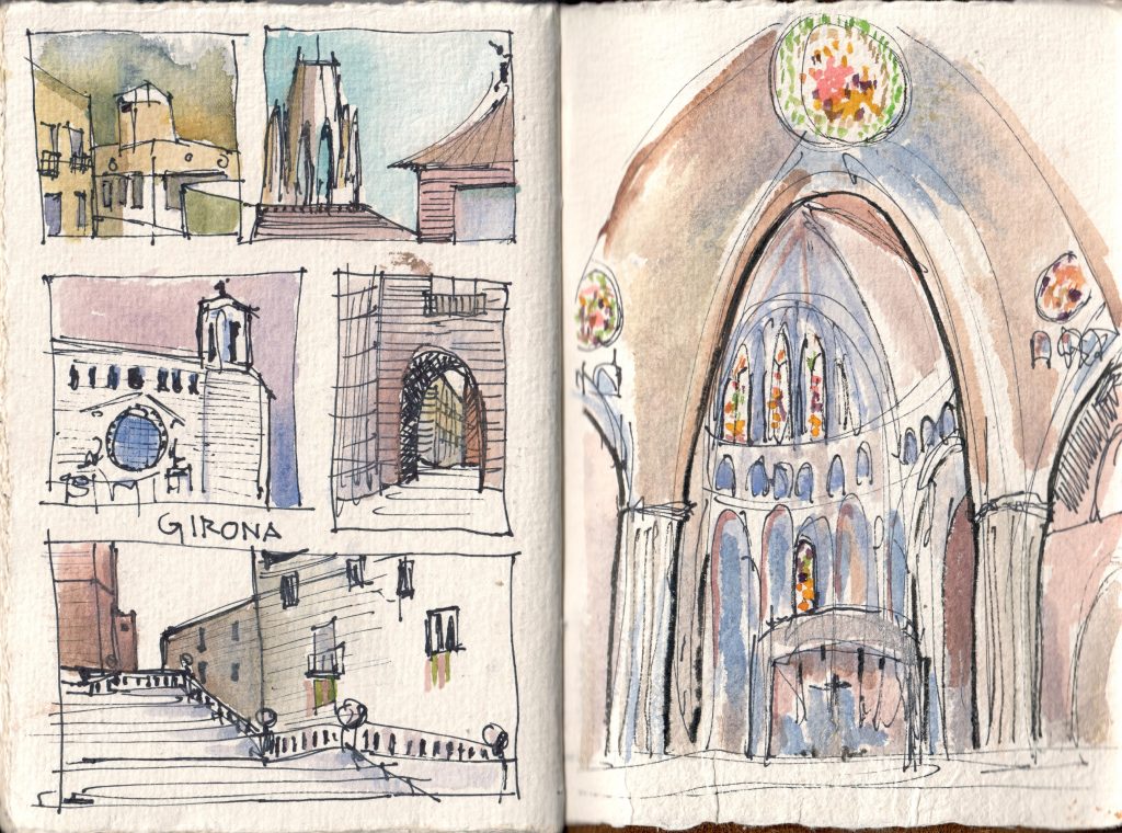
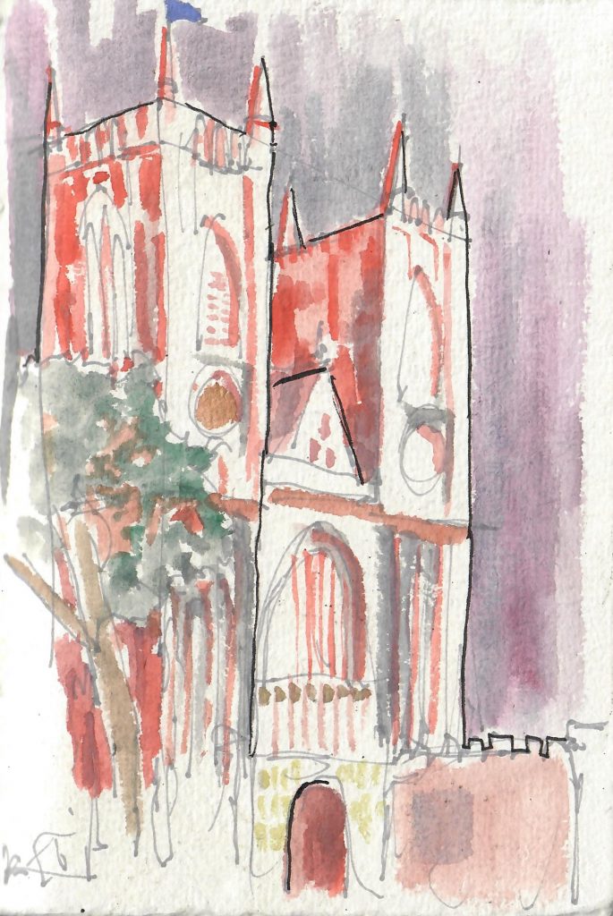
Girona, Spain, 2018
What draws me to a scene asking me to sketch it is typically a combination of interesting geometry, depth, and contrast. Odd angles, hard and soft edges, and dramatic curves make the interesting geometry. A foreground that draws you into to a midground, in front of a background gives me the depth. Having the darkest points in the scene adjacent to the brightest points introduces the contrast that sets the mood. I then can interleave the colors through the composition to develop the personality of the sketch. The sketch is a scaffolding for the colors.
That gets me a back to the color of the sky. Color affects me. As I walk through a field of sunflowers in Provence, as I touch the red stones of hilltop Roussillon, The colors imprint on me begging my hand and eye to use them to chronicle the journey. By the time I had traveled from Gaudi’s Barcelona to the medieval city of Girona, to Provence and finally to the sundrenched Nice that a striking red and deep yellow had to get out onto my page. That’s why I painted the blue sky of Nice crimson and yellow.

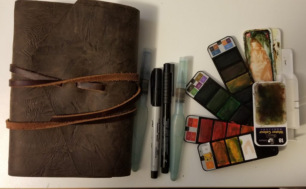
 Always wanting to try new tools, I purchased a new travel watercolor kit online with an interesting array of 18 vibrant colors but with only two mixing pans. This forced me to try developing my colors on the page. I used a wet-on-wet on wet technique where I first wet the are that I wanted to color with clean water and then added dabs of color to parts of the water puddle on the page. The pigment particles suspended in the water spidered out across the puddle blending with other colors dispersing with their entropy. The flexibility of my journal meant more difficulty controlling the water as it inched towards the edges of the page aided by gravity and limited by the evaporating water. This was the challenge that I jumped at. A few months earlier, I had met up with some