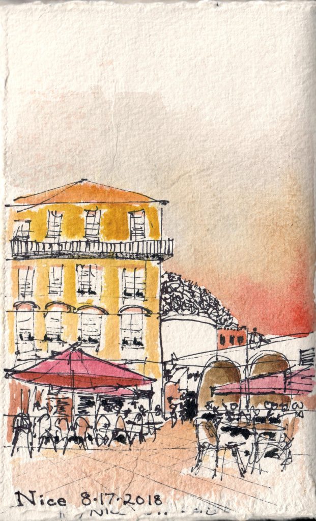
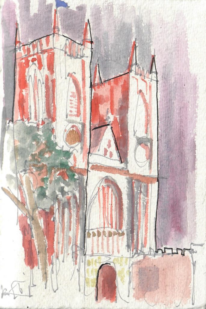
With the warm Cote d’Azur late afternoon sun on my neck, I looked out on the deep blue cloudless sky of Nice and I knew right there that when I painted the blue sky it must be a bright crimson melting to yellow. Capturing the past two weeks in watercolors and sketches was my way of chronicling my family vacation from Spain to France. I have been doing a type of art/travel of journaling for thirty years now, punctuating my travels into individual pages in a leather-bound journal filled with watercolor paper. Now I was taking the scene in front of me and reconstructing it on one of those pages. To explain how I constructed this specific painting I’d like to give you a bit of the story on how my style developed. Since I started watercoloring 30 years ago, I had learned and perfected a conservative wet-on-dry watercoloring technique perfect for portable watercolors and journals but now I was experimenting with a much more random whatever-may-come wet-on-wet vibrant-color method. I was trying something new and it was exhilarating.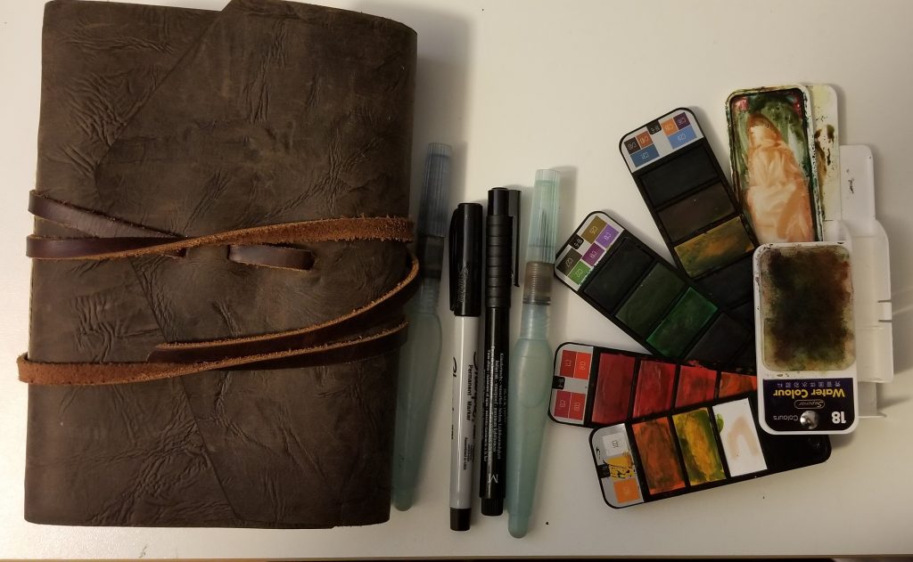
To give a bit of a background, I learned watercoloring when studying architecture and always strived for accurately representing the colors that I saw. I used a travel watercolor set with nine mixing pans which allowed me to mix and develop a color off the page, and when it was just right, I filled my brush with it, and stroked on the page of the journal composing a colorful painting. The synthesis of color adjacent to the white of the paper gave the watercolor it’s unique feel. It’s a very safe method and the interplay of chroma was found in the intersection of opposites, mixing the red with the green, the blue with the orange.
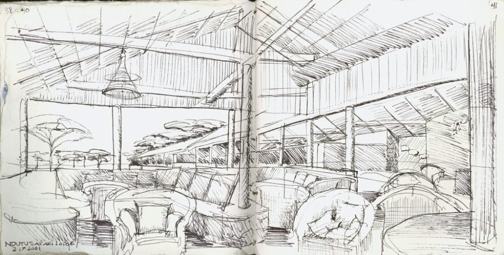
The funny thing is that my drawing technique is the opposite of safe. My preferred drawing tool is an ultra-fine-point Sharpie pen with a deep black waterproof ink whose marks are indelible, definite, undoable. I always liked deep, dark, marks, never erasable graphite. My affinity towards pens over pencils started also in architecture school when I tried publishing my work with the common tool of the time, a Xerox photocopier. Back then, the photocopier reproduced the subtle shading of pencil drawings horribly so I gravitated towards the crisp, dark, blackness of fountain pens which flowed an opaque contrast onto the white paper. My favorite was the Lamy Safari, which unlike many I’ve used was extremely reliable. The black music of ink flowed from the nib with ease and fluidity keeping up with my ambition to chronicle places.
With that fountain pen, I honed my forgiving
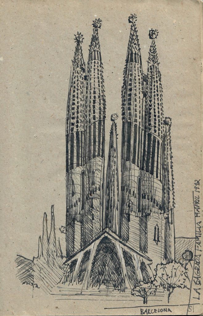
sketching style living up to Mike Lin‘s mantra “be loose.” I developed my
poché styles of stippling, crosshatching, and controlled scribbling, understanding that the texture and tone mattered more than the color. Put together with a mastery of freehand perspective taught by the late Kirby Lockard at the University of Arizona, my style started to develop. I combined accurate perspective with a loose sketch style to quickly capture places, moods, ideas, notions, and the shapes that inhabited my vision. Nothing was out of bounds, musicians, animals, street scenes, doodles, all inhabiting the page along with the ephemera of my travels documenting my journey.
 Always wanting to try new tools, I purchased a new travel watercolor kit online with an interesting array of 18 vibrant colors but with only two mixing pans. This forced me to try developing my colors on the page. I used a wet-on-wet on wet technique where I first wet the are that I wanted to color with clean water and then added dabs of color to parts of the water puddle on the page. The pigment particles suspended in the water spidered out across the puddle blending with other colors dispersing with their entropy. The flexibility of my journal meant more difficulty controlling the water as it inched towards the edges of the page aided by gravity and limited by the evaporating water. This was the challenge that I jumped at. A few months earlier, I had met up with some Urban Sketchers in London to spend the afternoon sketching and saw firsthand in Homephoenix Wong a watercolorist who purposefully painted in the wrong colors. It was marvelous seeing yellows, vermillion, and purples in a London overwhelmed by grays and browns. I had to try this.
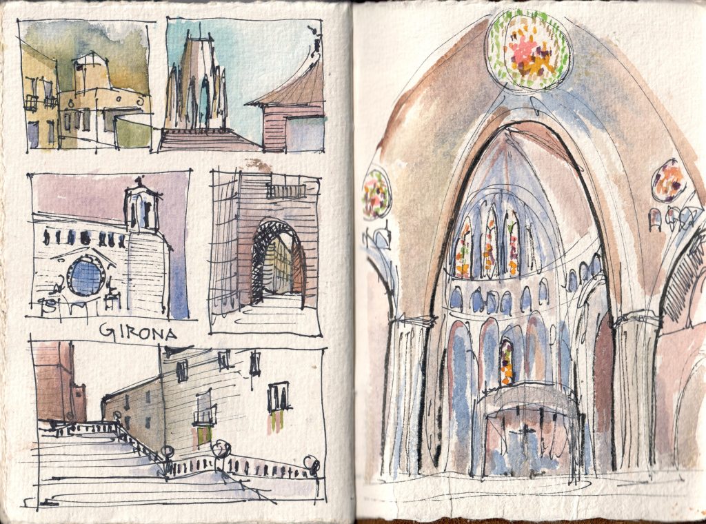
What draws me to a scene asking me to sketch it is typically a combination of interesting geometry, depth, and contrast. Odd angles, hard and soft edges, and dramatic curves make the interesting geometry. A foreground that draws you into to a midground, in front of a background gives me the depth. Having the darkest points in the scene adjacent to the brightest points introduces the contrast that sets the mood. I then can interleave the colors through the composition to develop the personality of the sketch. The sketch is a scaffolding for the colors.
That gets me a back to the color of the sky. Color affects me. As I walk through a field of sunflowers in Provence, as I touch the red stones of hilltop Roussillon, The colors imprint on me begging my hand and eye to use them to chronicle the journey. By the time I had traveled from Gaudi’s Barcelona to the medieval city of Girona, to Provence and finally to the sundrenched Nice that a striking red and deep yellow had to get out onto my page. That’s why I painted the blue sky of Nice crimson and yellow.